Disclaimer: The opinions expressed in this article are my own and do not represent the views of Google. This content is based solely on publicly available information.This content is for educational and entertainment purposes only. The author is not a financial advisor, and the content within does not constitute financial advice. All investment strategies and financial decisions involve risk. Readers should conduct their own research or consult a certified financial professional before making any financial decisions.
People often call the years from 2000 to 2009 the “Lost Decade,” for US market, and if you listen to the skeptics, they’ll tell you this stretch of time is all the proof you need that buying and holding stocks just doesn’t work. They usually point to the S&P 500 chart, which looks almost like a flat line for those ten years, and say that betting on the stock market is no better than gambling. But I think this decade is a great example of how our perspective shapes what we see. If you look at it without much background, it might seem like the stock market just failed. But if you approach it like an engineer, you might notice that the market started off in a really unusual place, and then spent the next ten years just working its way back to something more normal.
It’s important to be clear about the exact dates here, because this decade wasn’t just any ten-year stretch. What made it so unusual is that it started with one major crisis and ended with another. In early 2000, the Dot-com bubble burst, which was really about people paying sky-high prices for tech companies that weren’t actually making money. Then, by early 2009, we hit the Great Financial Crisis, which was all about too much borrowing and the banking system nearly falling apart. In between those two extremes, the S&P 500 went from a peak of about 1527 down to a low of 676. So when people talk about the decade being “lost,” it’s not just because the market wandered around aimlessly. It’s more like what happens if you buy something at the most expensive moment and then try to sell it when everyone is panicking.
The physics of P/E compression
If you really want to understand what happened to the S&P 500 during this stretch, you have to start with how expensive stocks were at the beginning. It’s easy to think that the market’s weak performance was because companies just stopped making money, but that’s not what actually happened. In fact, if you look at the numbers, S&P 500 companies kept growing their earnings throughout the 2000s. Earnings per share for the whole index started the decade around $53.70 and ended up even higher, even though there was a huge dip during the 2008 recession. So the businesses themselves kept chugging along; it was the stock prices that didn’t keep up.
The real issue was how much investors were willing to pay for each dollar of earnings. Back in 2000, people were so optimistic that they were paying about 44 times earnings, which is way above normal and really only makes sense if you think companies are going to grow like crazy forever. By the time 2009 rolled around, the mood had completely flipped, and that number dropped to about 15 times earnings. If you look at the chart, you can see this gap: the green dashed line shows that company earnings kept moving up at a pretty steady pace, while the blue line—the market price—started out so far above reality that it took a whole decade of flat returns just for the fundamentals to catch up.
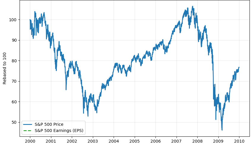
This is a good way to picture what people mean when they talk about ‘P/E Compression,’ which is really just a fancy way of saying that the market started valuing each dollar of company earnings less than it used to. So, even though companies were selling more products and making more money, the overall market decided to be more cautious about how much it was willing to pay for those profits. If you were holding the S&P 500 during this time, you saw almost all of that business growth get wiped out by this shift in attitude. In practical terms, it was like paying $44 for every dollar of earnings at the start, only to find out later that the market would only pay $15 for that same dollar.
The illusion of price returns
A lot of the time, people just look at the main price chart for this period and see that it dropped by about 24%, but that only tells part of the story. If we want to really understand what happened, we need to remember that total returns are made up of more than just price changes—they also include dividends and the effects of inflation, which are easy to overlook but make a big difference.
If you add in the effect of reinvesting dividends, the loss over the decade doesn’t look quite as bad—it’s closer to 9% instead of the headline number. That said, this is still only part of the picture, because it doesn’t account for how much prices rose during those years. The 2000s were a time when inflation was much higher than what we saw in the 2010s, and over the decade, prices went up by about 28%. So, if you adjust for that, the real return for someone who invested in the S&P 500 was actually a loss of more than 40% in terms of what your money could buy. This is why just breaking even on paper isn’t enough; if your investments aren’t keeping up with rising prices, you can end up losing a big chunk of your actual wealth, even if the numbers look okay at first glance..
Asset allocation as a survival mechanism
The narrative that “stocks didn’t work” is factually incorrect. It wWhen people say that ‘stocks didn’t work,’ they’re missing a big part of the story, because what really happened is that US Large Cap Growth stocks had a rough time. The S&P 500 gets a lot of attention, but it’s just one slice of the market, and in the 2000s, it turned out to be one of the toughest places to invest. If you step back and look at the whole range of investment options, you see a completely different picture, since while the big US companies were struggling just to stay afloat, other types of stocks were actually doing really well. Here’s what I mean:
- S&P 500: -24% (Price Return)
- Small Cap Value: +143%
- Emerging Markets: +162%
- REITs: +188%
So instead of thinking of this period as a market crash, it makes more sense to see it as a rotation, where money moved away from the overhyped tech companies of the late 90s and found new homes in things like real estate and international markets that were just starting to take off.
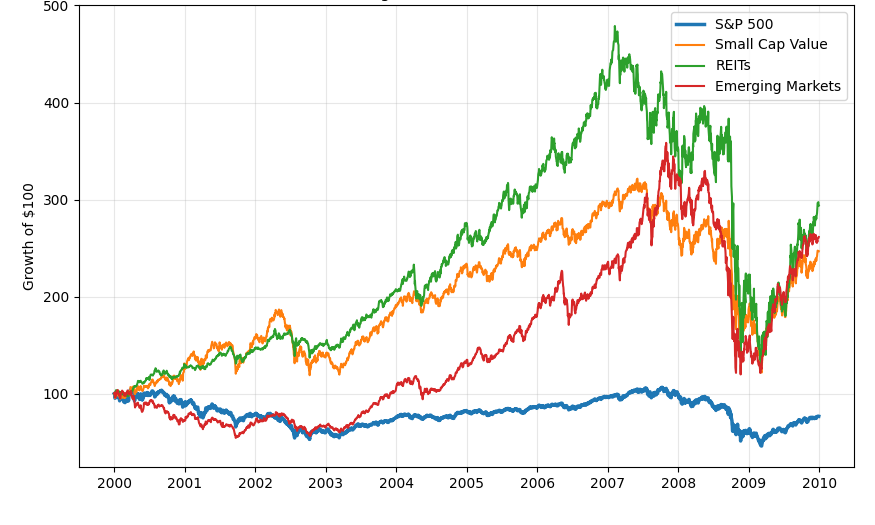
If you were the kind of investor who spread your bets across the globe, you probably didn’t feel like you lost a whole decade; instead, you just went through a period where your portfolio needed to shift its weight a bit. It’s a lot like how engineers design airplanes with more than one engine, so if one sputters out (like US Large Cap stocks did), the others—maybe Small Cap, international stocks, or real estate—can keep things moving forward and help you stay in the air.
The sequence of returns
A lot of big-picture analysis skips over the way real people actually invest their money, especially when it comes to how cash flows in and out. Most of us aren’t dropping a huge pile of cash into the market on a single day and then walking away for a decade; instead, we’re earning paychecks and putting money in bit by bit, which ends up making a huge difference in how things turn out.
To see how this plays out, I ran a little experiment to compare two different ways of investing over this exact time period
- Lump Sum: Investing $120,000 on Jan 1, 2000.
- Dollar Cost Averaging (DCA): Investing $1,000 every month for 120 months.
The results might surprise you. If someone put all their money in right at the top, they would have watched their portfolio shrink to about $91,000 by 2009, which means they lost nearly a quarter of what they started with, simply because they caught the market at a rough time and had to ride out all the ups and downs without any cushion.
But if you were the kind of person who just kept putting in the same amount every month, you would have ended up pretty much breaking even, with around $115,000 at the end. The reason is that the market’s ups and downs actually helped you out, since you bought more shares when prices were low (like in 2002 and 2008) and fewer when things were expensive, so your average cost ended up being lower overall.
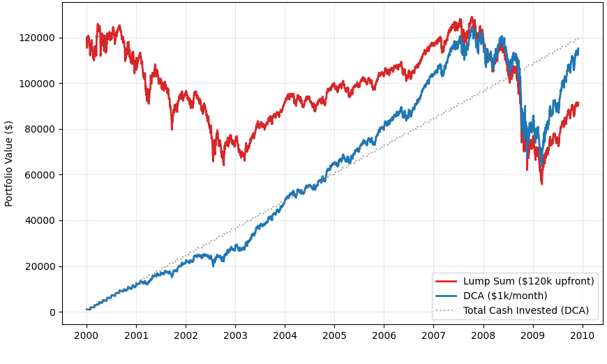
If you look at the chart above, you can see that while both lines take a hit during the 2002 crash, the blue line, which represents dollar-cost averaging, bounces back much more quickly than the red line, which shows what happens if you invest everything at once. This is a great example of what people call ‘Behavioral Alpha,’ because for someone steadily adding to their investments, what looked like a lost decade was actually a chance to pick up more shares at lower prices, turning what felt like a crisis into an opportunity.
Conclusion
If we set aside the usual worries and just look at what actually happened during the so-called “Lost Decade,” the story starts to look a lot different. The market didn’t really break; it just needed to hit the reset button after all the excitement at the start of the 2000s. The S&P 500’s flat performance wasn’t because companies stopped making money, but because the market had to work through a lot of leftover hype. It was a tough stretch, but it made sense, since things were shifting from wild optimism to a focus on what businesses were actually worth. For anyone investing today, I think those years are less of a warning sign and more of a lesson in how to build a sturdy portfolio. What really stands out is that putting all your eggs in one basket—like only owning big US growth stocks—can leave you exposed, while spreading things out across value stocks, real estate, and international markets gives you a much better shot at riding out the rough patches. And honestly, just sticking with regular investing, even when prices are falling, turns out to be a pretty reliable way to set yourself up for future growth.
In the end, the “Lost Decade” really only felt lost for people who bought in at the peak and then just left their investments alone. For anyone who spread things out, kept adding to their portfolio, or paid attention to how much companies were actually earning instead of just watching prices, it was more like a tough journey that eventually circled back to better times. The market didn’t quit on anyone; it just asked for a bit more patience and discipline than what worked in the 90s.

Leave a Reply