Disclaimer: The opinions expressed in this article are my own and do not represent the views of Google. This content is based solely on publicly available information.This content is for educational and entertainment purposes only. The author is not a financial advisor, and the content within does not constitute financial advice. All investment strategies and financial decisions involve risk. Readers should conduct their own research or consult a certified financial professional before making any financial decisions.
The whole idea behind passive investing is that the market, as a group, is smart enough to figure out what every stock is worth at any given moment, so if you just buy an index fund that tracks the biggest companies, your money should end up spread out in a way that matches their real value. But this neat theory starts to fall apart when too much money piles into just a few giant companies, because then their prices can shoot way above what their actual future profits would suggest.
When just a few companies start soaking up almost all the new investment money, the market stops acting like a fair judge of value and instead turns into a kind of popularity contest, where prices keep rising just because they’ve already been rising. This kind of imbalance tends to get pushed to the limit, and if you look back at history, you’ll see that these moments usually come right before a long stretch where spreading your bets more evenly across all companies actually works out much better. The real risk for everyday investors is not noticing when your index fund quietly shifts from being a safe, diversified basket to basically a big bet on a handful of tech giants.
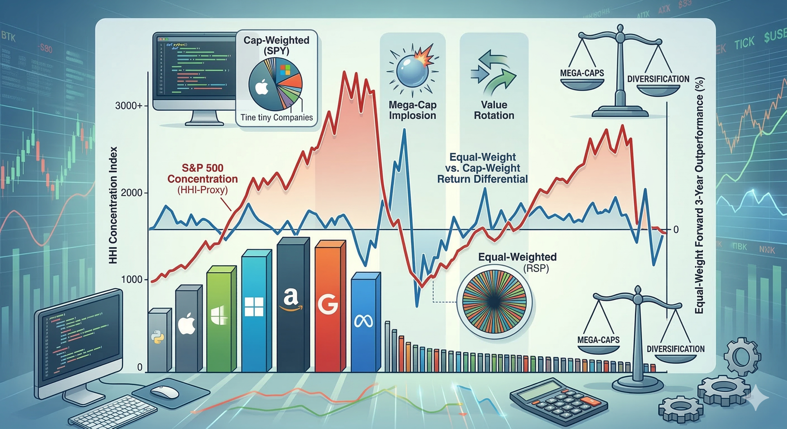
There’s actually a simple math tool called the Herfindahl-Hirschman Index, which the government uses to spot monopolies, and investors use it in pretty much the same way to see how much an index is dominated by just a few companies. If you keep an eye on this number for something like the S&P 500, you can get a clear sense of when the market is nicely spread out and when it’s getting dangerously top-heavy. What’s even more interesting is that when things get too lopsided, it almost always sets the stage for a big shift, where the usual winners suddenly lag behind and the underdogs catch up in a hurry.
If you really want to keep your investments safe, it helps to know what kinds of big-picture changes tend to flip the script, so you can spot the right moments to step away from the usual index approach and move some of your money out of the biggest names before everyone else catches on.
The mechanical definition of the Herfindahl-Hirschman Index
When people talk about concentration risk, especially on financial news channels, it often sounds pretty fuzzy and hard to pin down, but if we want to actually measure it in a way that stands up to real analysis, we need something more concrete, and that’s where the Herfindahl-Hirschman Index comes in, since it gives us a simple recipe: take the market share of each player, square those numbers, and add them all up.
Imagine you have an index with 500 companies, and each one makes up exactly 0.2% of the total; in that case, the HHI is basically zero, which means the influence is spread out so evenly that even if something wild happens to one company, it barely makes a dent in the overall direction of the index, and this is pretty much the gold standard for what people mean when they talk about perfect diversification.
But if you flip that around and picture an index where one company takes up 90% of the weight while the other 499 have to share what’s left, the HHI shoots way up, because squaring that huge number really highlights how risky it is to have so much riding on a single company; at that point, even though it looks like you own a big, diverse basket, you’re really just holding one stock with a bunch of tiny extras that barely matter.
Now, if you actually want to track the HHI for something like the S&P 500 every single day over the last couple of decades, you would need a huge, detailed database that keeps track of exactly how much each company is worth and how those numbers change over time, but since that kind of data is usually locked away behind paywalls, researchers often use a different trick that gives almost the same answer in real time.
The shortcut is to look at the difference between the regular S&P 500, which is weighted by company size (that’s SPY), and the version where every company gets the same slice of the pie (that’s RSP), because RSP always keeps things balanced with each company at about 0.2%, so its HHI stays close to zero, while SPY lets the biggest companies take up more space as they grow; by comparing the price of SPY to RSP, you get a really clear picture of how much the market is favoring the giants over everyone else.
So, when the gap between SPY and RSP gets a lot bigger, that’s a sign that the biggest, priciest stocks are pulling away from the pack while most of the other companies are just treading water, which means the HHI is rising and the market is piling more risk onto just a few names; but if that gap shrinks, it usually means either the rest of the market is catching up or the big players are stumbling, and if you look at how this pattern has played out over the last twenty years, you start to see a surprisingly steady rhythm in how markets concentrate and spread out risk.
Mapping the concentration regimes
If you run a simple Python script to follow this concentration ratio over the past twenty-six years, you’ll see that the market doesn’t just quietly spread money around in a neat, efficient way. Instead, it goes through these big, repeating cycles where a handful of companies end up with way too much of the pie, and then things suddenly swing back the other way.
The Dot-Com crash in the early 2000s is probably the clearest example of what happens when things get too concentrated at the top. Back in late 1999, a few big telecom and software companies took up a huge chunk of the whole US stock market, way more than made sense. When that bubble finally burst, the market spent almost the entire next decade swinging back in the other direction. For about eight years after the 2000 peak, the equal-weighted index (which treats every company the same) did much better than the usual cap-weighted one, because the biggest companies just sat there while the smaller, often overlooked stocks actually drove most of the returns.
During the 2010s, the market was basically recovering from that big swing, settling into a pretty steady and balanced phase. But all of that changed when the pandemic hit in 2020.
With interest rates at zero, central banks pumping money into the system, and everyone suddenly needing cloud services and digital tools, the market saw one of the biggest concentration spikes ever. By 2021, if you bought the S&P 500 (the SPY), you were really just putting most of your money into five giant companies. Big investors rushed into these huge, easy-to-trade tech stocks, which pushed the market’s concentration to levels we hadn’t seen before.
When the Federal Reserve finally raised interest rates in 2022, that whole concentration story started to unravel. Tech stocks took a big hit, which dragged down the SPY, but the equal-weighted version (RSP) held up pretty well and only saw a mild dip.
You can almost set your watch by how this plays out: a few standout companies suddenly start making a lot more money, so big investors pile into those stocks. Then, because of how index funds work, they have to buy even more of those same big companies, no matter how expensive they get. This cycle keeps pushing the market’s concentration higher and higher, until something big happens—like a credit crunch, a jump in interest rates, or a drop in earnings—and then the whole thing snaps back, with the market quickly shifting back toward a more balanced state.
Predicting the equal-weight outperformance
If we want to see whether really high market concentration tends to snap back over time, we can look at past data to see how often a crowded market today leads to better returns from an equal-weighted portfolio over the next three years. The basic idea is that when the ratio between SPY and RSP gets unusually high, it usually means that the biggest stocks have pulled far ahead, and that sets the stage for the equal-weighted approach (RSP) to catch up and even beat the regular cap-weighted one (SPY) in the years that follow.
To check this, we can look at the daily prices for both ETFs, starting from when RSP began in 2003 and going up to early 2026. By tracking a simple measure of how concentrated the market is (and smoothing it out over fifty days so we don’t get distracted by day-to-day noise), we can see how that lines up with the difference in returns between the two funds over the next three years. In other words, if you bought the equal-weighted fund on any given day, how much extra return would you have made compared to just sticking with the regular cap-weighted one three years down the line?
When you plot this out, you get a chart with two lines: one shows how concentrated the market is over time, and the other shows how much better (or worse) the equal-weighted fund does compared to the cap-weighted one over the next three years. Whenever the concentration line shoots up, it means the biggest companies are taking over most of the market, and that’s usually when the equal-weighted approach starts to pull ahead. So, whenever you see the outperformance line above zero, that’s a sign that equal-weight investing is winning out over the traditional approach.
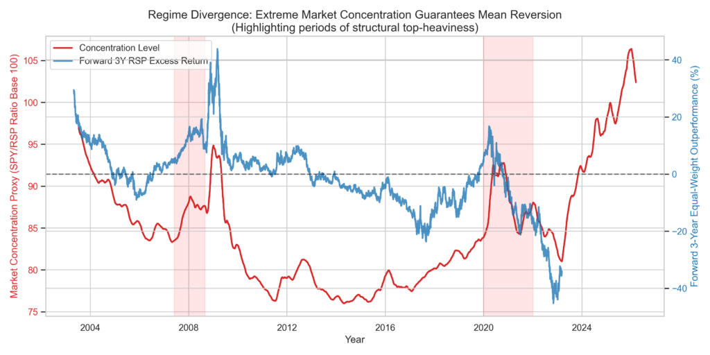
If you take a close look at the visualization, you’ll notice that when the red shaded areas show those moments of really high concentration, the blue line tends to move in the opposite direction, almost like they’re on a seesaw together.
Right before the 2008 financial crisis, you can see that the market became really concentrated, with the financial sector taking up a huge share. If someone had chosen to invest in an equal-weight ETF at that point, they would have seen much better results over the next three years, since the equal-weight approach spreads risk out across lots of different sectors like energy, consumer staples, and healthcare, instead of putting most of the eggs in one basket like the cap-weighted index did.
If we jump ahead to the big red area from 2020 through late 2021, you’ll see that the concentration line shoots up as the biggest tech companies soak up all the extra money flowing into the market. The measure of how concentrated the market became (which is just a way of saying how much a few companies dominated) reached levels we hadn’t seen since the Dot-Com bubble.
Right after that peak in concentration, the blue line starts climbing quickly. Investors who stuck with the cap-weighted approach took some pretty tough losses in 2022, while those who used equal-weight managed to avoid most of the pain. When a portfolio gets really top-heavy, it’s almost like it’s asking for trouble, because the odds of a big drop become much higher than the chance of squeezing out a little more growth.
So, the graph really shows that riding the wave with cap-weighted index funds can work well as long as the concentration keeps going up, which helps explain why passive investing is so popular when markets are strong. But it also points out a risk that’s easy to overlook: if that concentration trend suddenly reverses, the losses tend to hit hardest right where investors have the most money tied up.
The mechanics of the structural rotation
If you want to trade the concentration proxy well, it helps to really get how money actually moves around when things finally start to shift. When the HHI gets to a really high level, it basically means that most of the money in the stock market is sitting in just a few big names. So if something big happens in the economy, like a sudden spike in inflation or a major bank running into trouble, big investors have to pull their money out of those crowded stocks and quickly find somewhere safer to put it.
With cap-weighted indexes, the system has no choice but to sell a lot of the biggest stocks, just because those stocks make up so much of the index. So if someone pulls $100 million out of something like SPY because they’re worried about a downturn, the trading desk has to sell about $30 million worth of just the top five tech companies, even if the market is already dropping. This kind of forced selling can turn a small problem into a much bigger one, since it puts even more pressure on the stocks that were already the most crowded.
Equal-weight funds work in almost the opposite way when things get rough. Since something like RSP spreads money out more evenly, it naturally moves money away from the biggest names and into the other 490 stocks—like those in value, industrials, or more cyclical sectors. In a way, it gets your portfolio set up ahead of time in the same places where big investors tend to move their money when a crisis hits.
Back in 2022, when tech stocks started to tumble, big investors rushed out of software and hardware giants and started buying up companies that make steady cash, like utilities, energy, and everyday consumer goods. The cool thing about RSP is that, by design, it already puts more weight on those overlooked, value-heavy sectors, even before the crowd catches on. Its regular rebalancing means you end up ahead of the big shift into safer stocks.
This automatic shifting of money is really what drives the outperformance you see in the charts. It’s not just about dodging the big losses in the top five stocks; it’s also about catching the extra gains from the other 495 names as big investors start buying them up for safety.
The behavioral cost of abandoning momentum
If you buy into the market when the big companies are more dominant than they’ve been in a generation, you’re basically setting yourself up for trouble if something goes wrong with one of those giants. When things eventually swing back the other way, spreading your investments out more evenly across all companies tends to do much better by comparison.
But actually doing something about this is tough, because when the biggest companies are on a roll, they really do seem unstoppable. Think about how Amazon took over online shopping, Google became the go-to for search ads, and Apple pulled in most of the profits from selling phones. Their huge size made sense because they were making so much money.
If you decide to move your money into an equal-weight index while those big companies are still climbing, you’re basically choosing to lag behind your friends, coworkers, and all the headlines for a while. It means cutting back on the hottest stocks right when they seem like they can do no wrong, and instead putting more into companies that aren’t making headlines—like utilities or old-school manufacturers that aren’t exactly exciting right now.
This is exactly why market bubbles can get so out of hand. Most professional fund managers just can’t afford to sit on the sidelines while everyone else is making money, because if they fall behind the S&P 500 for a few years in a row, their clients will probably leave and they might even lose their jobs.
But if you’re an individual investor, you actually have an edge here, because you don’t have to answer to a board or worry about quarterly reports. You can spot when the market is really lopsided, shift your money into a more balanced mix, and just wait for things to even out—without having to worry about losing your job if you’re not beating the market every single year.
Reading the modern regime
We’ve seen, time and again, that the Herfindahl-Hirschman Index is about as good a warning sign as you can get when it comes to spotting turning points in the stock market. If you choose to ignore what it’s telling you—especially if you’re putting a lot of money to work right when the index is peaking—you’re likely to pay a steep price for it.
When you’re building a portfolio, the real challenge is figuring out which risks you can actually live with. If you lean too hard into the biggest, fastest-growing stocks, you’re basically signing up for some rough times when things swing the other way. On the flip side, if you spread your bets evenly and play it safe, you might have to watch your portfolio lag behind for years, especially if tech stocks are having a wild run.
A good chart can help you spot the moment when it makes sense to stop chasing momentum and start looking for some protection. If you see that the concentration line is flat or even lower than usual, that’s usually a sign that the market is working pretty well and prices make sense.
But when that concentration line shoots up like a rocket, it’s a sign that something’s off. Suddenly, just a handful of giant companies are calling all the shots, and the rest of the market barely matters. At that point, you’re not really investing in the whole economy anymore—you’re betting big on a few tech giants that might not be as sturdy as they look. And when things finally turn, it’s usually the folks who went against the crowd who come out ahead.
References
[1] Asness, C., Frazzini, A., & Pedersen, L. H. (2019). Quality Minus Junk. Review of Accounting Studies.
[2] Fama, E. F., & French, K. R. (2015). A Five-Factor Asset Pricing Model. Journal of Financial Economics.
[3] S&P Dow Jones Indices. (2025). The Impact of Market Concentration on Index Returns.
[4] yfinance Documentation and API data. (2026). Aggregate historical closing prices for S&P 500 Cap-Weighted and Equal-Weighted proxies.

Leave a Reply