Disclaimer: The opinions expressed in this article are my own and do not represent the views of Google. This content is based solely on publicly available information.This content is for educational and entertainment purposes only. The author is not a financial advisor, and the content within does not constitute financial advice. All investment strategies and financial decisions involve risk. Readers should conduct their own research or consult a certified financial professional before making any financial decisions.
In the financial world, December is often less about balance sheets and more about folklore. Traders speak of the “Santa Claus Rally” with the same reverence usually reserved for audited earnings reports. “As an engineer, I see the market as full of random distractions with very little useful information. To me, these seasonal sayings aren’t backed by real proof. “Sell in May and go away?” Maybe. ‘The January Barometer’? I doubt it.”
But the Santa Claus Rally (SCR) is specific. Defined by Yale Hirsch in 1972, it is a precise 7-trading-day window: the last five trading days of the current year plus the first two of the New Year. The theory posits that low institutional volume, typically driven by holiday vacations, combined with the completion of tax-loss selling, creates a drift in the market—a “long bias” due to the absence of sellers. There is also a darker side effect known as the ‘Indicator’ risk also exists: “If Santa Claus should fail to call, bears may come to Broad and Wall.” In other words, a negative SCR predicts a bear market
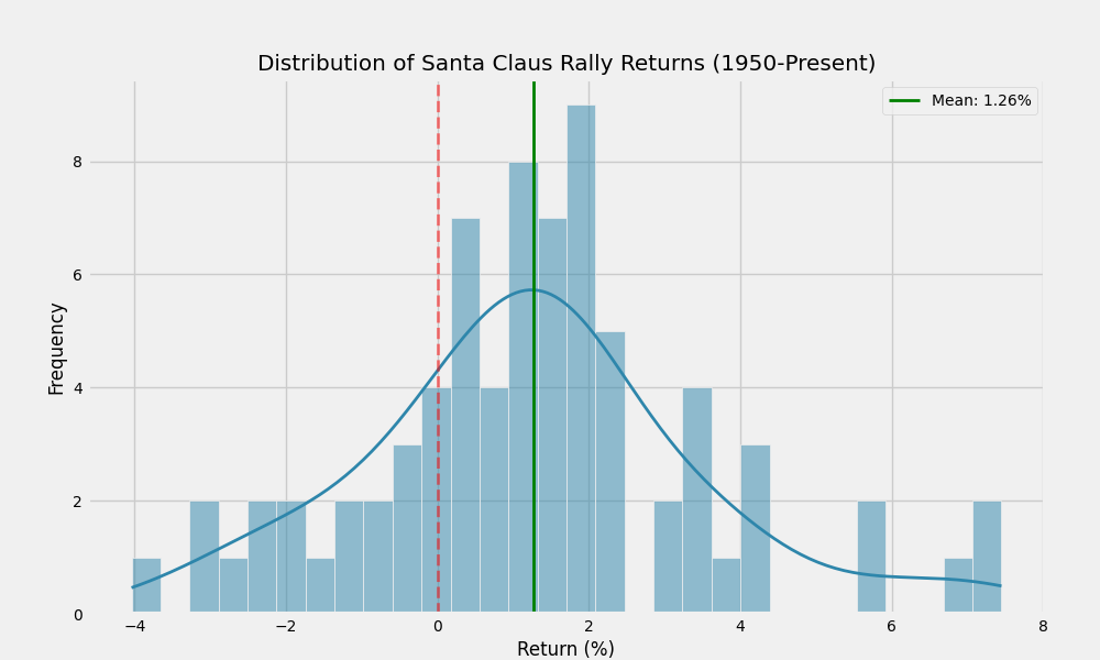
I don’t trust rhymes; I trust data. So, I pulled the daily history of the S&P 500 dating back to 1950 to see if this phenomenon holds up to scrutiny. The results were more significant than I expected. To visualize the probability of these returns, I plotted a frequency distribution of the SCR performance. Instead of a perfect bell curve centered on zero, the data clearly skews to the right, visually confirming the positive bias inherent in this specific time window.
Measuring Market Liquidity
When we isolate this specific 7-day window over the last 75 years, the data reveals a statistically significant anomaly. Since 1950, the S&P 500 has posted a positive return during this window 77.3% of the time. This is an exceptionally high win rate for any short-term market signal. For context, the random probability of the market being up over any given 7-day period hovers closer to 56-58%.
The average return during these seven days is 1.26%. While that might sound small, annualized, it represents a blistering pace of appreciation. If the market compounded at that rate for a full year, the index would nearly double. This suggests that the liquidity hypothesis—that the absence of institutional sell orders allows prices to drift upward on retail optimism—has merit. When the “market makers” are in the Hamptons, the bid-ask spread widens, and the natural drift of a non-pressured market seems to be up.
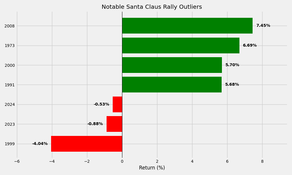
Averages tend to mask the underlying volatility. Ironically, the strongest signal in the dataset appeared during the depths of the Global Financial Crisis. The 2008 rally delivered a staggering 7.45% gain, demonstrating that high volatility can breed massive short-term spikes. At the other end of the spectrum, the worst modern performance occurred in 1999 with a 4.04% decline right before the Dot-Com bubble burst. Historical data from the Great Depression shows an even deeper 5.0% plunge in 1931. These outliers suggest the indicator flashes its brightest warnings during significant market deleveraging events..
While the average is comforting, the extremes tell a more volatile story. The chart below isolates the most significant outliers, contrasting the massive gains often seen during recession recoveries against the sharp warning signals that preceded major market crashes like the Dot-Com bubble
Reading the Warning Signs
The more critical question for long-term investors is the second part of Hirsch’s theory: the warning sign. Does a failed rally actually predict a downturn? The scatter plot below visualizes this relationship. To test the predictive power of the rally, I mapped each year’s SCR return (x-axis) against the subsequent full-year performance (y-axis). If the ‘Indicator’ theory holds water, we would expect to see a clear separation where negative holiday rallies cluster with negative annual returns
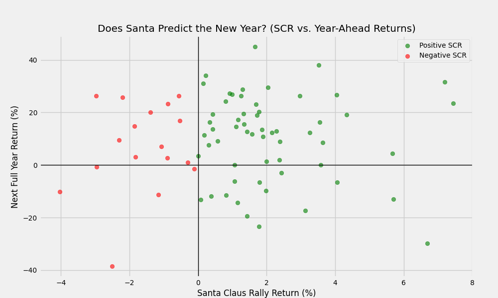
The data supports the warning, though perhaps not as catastrophically as the rhyme suggests. When the Santa Claus Rally is positive, the S&P 500 averages a 10.20% return in the following year. However, when the rally fails (returns are negative), the average return for the following year drops to 6.74%. While not a guarantee of a bear market, a failed rally effectively slices the expected forward return by nearly 350 basis points. In system engineering terms, a failed SCR acts as a “low pressure” warning. It indicates that even in a period historically biased toward buying (or at least, lack of selling), the selling pressure was sufficient to overwhelm the drift. That underlying weakness often reveals itself more fully in Q1 and Q2.
The AI & Macro Override: The 2023-2025 Anomaly
It is vital to look at the most fresh data. The last two years have defied the “Indicator” rule. Both the 2023 and 2024 SCR windows were negative (-0.88% and -0.53% respectively). Yet, the market proceeded to rally significantly in the following years (2024 saw over 20% gains, and 2025 is up nearly 17% YTD). This recent divergence reinforces the engineer’s mindset: probabilities are not prophecies. The market has been driven by massive thematic shifts (AI, rate cycle anticipation) that outweighed the subtle seasonal drift. The “Check Engine” light turned on, but the car kept speeding. This doesn’t mean the signal is broken, but that the “signal-to-noise” ratio varies depending on macroeconomic volume.
Is the Pattern Breaking Down?
One common critique of market anomalies is that they are artifacts of a bygone era—patterns that existed in the 1950s or 80s but have been arbitraged away by high-frequency trading and algorithmic funds. To check for this “alpha decay,” I broke down the average SCR returns by decade. This segmentation allows us to test for ‘alpha decay’—the tendency for market edges to disappear once they become widely known. As shown below, the signal has not only survived the transition to the digital age but actually showed renewed strength in the 2000s and 2010s.
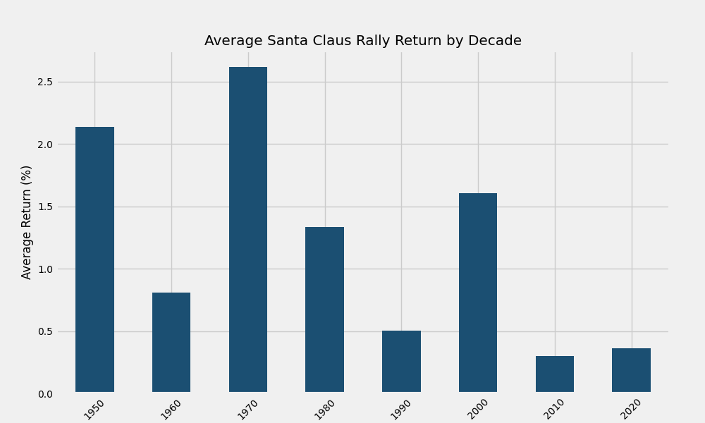
Surprisingly, the phenomenon has not decayed. In fact, the 2000s and 2010s saw consistent strength during this window. This persistence suggests that the driver isn’t an informational edge that can be arbitraged, but a structural one. The tax code hasn’t changed its calendar year, and human behavior regarding holidays has remained relatively constant. As long as tax-loss harvesting faces a December 31st deadline and liquidity dries up during the holidays, the structural forces behind this rally remain intact.
Takeaways
The Santa Claus Rally appears to be one of the few market adages that survives data interrogation. With a 77% historical strike rate and a clear disparity in forward returns between “good” and “bad” years, it represents a valid seasonality inputs for a broader market model. However, this is not a strategy to bet the farm on. A 1.26% average gain does not justify leverage or massive portfolio re-allocation. It is, however, a useful diagnostic tool. If we see green during these seven days, it is business as usual. If we see red, consider it a check engine light for the year ahead—not a guarantee of a breakdown, but a signal to check your risk tolerances.
In the end, the market doesn’t care about Christmas. But it does care about liquidity, and during the holidays, that liquidity story changes enough to create a measurable, exploitable drift.
References
- Hirsch, Y. (1972). The Stock Trader’s Almanac.
- Standard & Poor’s. (2025). S&P 500 Historical Data. [Data file]. Retrieved from Yahoo Finance.
- Malkiel, B. G. (2003). A Random Walk Down Wall Street. W. W. Norton & Company.

Leave a Reply