Disclaimer: The opinions expressed in this article are my own and do not represent the views of Google. This content is based solely on publicly available information.This content is for educational and entertainment purposes only. The author is not a financial advisor, and the content within does not constitute financial advice. All investment strategies and financial decisions involve risk. Readers should conduct their own research or consult a certified financial professional before making any financial decisions.
A lot of us have come to believe that by investing passively, we’re just holding a fair, balanced piece of the whole American economy, but that’s not really how it works. The way most index funds are built, using something called capitalization weighting, actually means you end up owning more of the companies whose stock prices have already gone up the most, even if those prices have drifted far away from what the companies are actually earning. So, instead of being neutral, you’re really just following the crowd and buying more of what’s already expensive.
What ends up happening is a kind of feedback loop, where money keeps pouring into these index funds, and the funds automatically put most of that money into the biggest companies, which pushes their prices up even more. Then, the next wave of money has to buy even more of those same companies, just because they’re now an even bigger part of the index. It’s like chasing whatever is already popular, without really stopping to ask whether those companies are actually worth that much. And if most of this money ends up in just one part of the market, the index stops looking like a snapshot of the whole economy and starts to look more like a big bet on one particular story or sector.
The mechanics of the momentum trap
Most of the time, when people talk about index funds, they make it sound like buying a basket of 500 companies is the safest way to avoid big losses from any one company falling apart, but if you look a little closer at how the S&P 500 actually works, you’ll see that the math tells a different story, because the index is set up so that just a handful of the biggest companies really drive what happens, while the bottom 300 or so barely move the needle at all, which means that when you buy the whole index, you’re mostly getting exposure to the giants and not really spreading your risk as much as you might think.
So, when you put your money into an S&P 500 index fund, what you’re really doing is betting that whatever is already going up will keep going up, instead of expecting things to swing back to normal, because the way the index is built means that if a certain group of companies suddenly gets really popular or their prices shoot up for any reason—maybe people are excited about a new trend or there’s just a lot of money sloshing around—the index automatically gives them a bigger slice, without stopping to ask whether those high prices actually make sense, and as a result, you end up owning more and more of the stuff that’s already expensive, right at the moment when it might be most risky.
We’ve watched this kind of trap play out before, and while the names of the companies might change over time, the basic math behind how these things work always stays the same.
Historic peaks and the valuation drag
If we want to get a real sense of this ‘valuation drag,’ we need to look past the stories people tell about a sector and focus on what it actually earns. What really matters, at the end of the day, is not how much the market is willing to pay for a sector right now, but how much net income that sector is actually bringing in for the index as a whole. One way to see where the story and the reality start to drift apart is to compare how much weight the technology sector gets in the market cap versus how much of the index’s earnings it actually produces, and it’s especially interesting to look at this during three big moments when the market got really concentrated: 1999, 2021, and 2026.
Back in the late 1990s, right before the dot-com bubble burst, technology seemed to take over everything. By the time we got to March 2000, tech stocks made up about a third of the S&P 500’s total market value, and people from all sides—whether they were everyday investors or big institutions—were piling in, convinced they were catching the next big wave in the global economy. They were absolutely right about the internet changing the world, but the numbers just didn’t add up: even though tech made up a third of the index by price, it was only responsible for about 15% of the total net income. So, in effect, the index was nudging everyone to put in twice as much money as the sector’s actual earnings could really support, and when things snapped back to reality, it wiped out more than a decade’s worth of returns.
Fast forward to 2021, and we saw a similar pattern, this time with a boost from super-low interest rates and all the extra spending on digital tools during the pandemic. Tech stocks made up about 29% of the index, and unlike in 1999, these companies were actually making a lot of real money—about 23% of the S&P 500’s total earnings. Still, there was a gap, because the market was acting as if this rapid growth could just keep going forever, even though, sooner or later, higher costs and the laws of math would slow things down.
Now, in early 2026, things have gotten even more lopsided. Tech alone makes up about 34% of the S&P 500, and if you add in companies from communications and consumer sectors that are really just tech in disguise, you’re looking at almost half the index being tied to the same big-picture economic trends. But even with all that weight, the main tech sector is still only bringing in about 23.5% of the total earnings for the index.
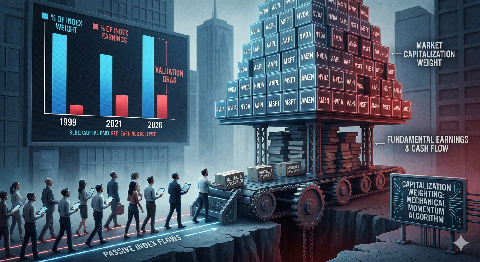
You can actually see this mismatch pretty clearly if you look at the bar chart below, which shows just how big the gap is between what you end up paying for tech in the index and what that sector is really earning in net income.
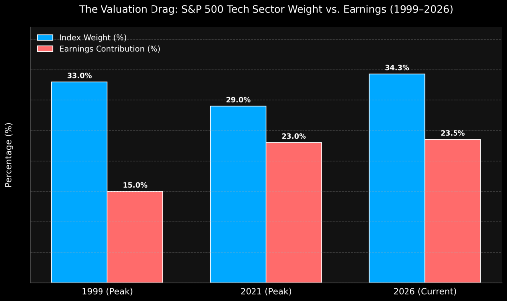
If you look at this chart, you can start to see why simply trusting capitalization weighting as the obvious, safe choice might not be as risk-free as it seems, because while the blue bars show the price you end up paying (thanks to how the index is built), the red bars show what you actually get back in cash flow, and the gap between those two is a pretty clear way to see how much value you might be leaving on the table if you just go along with the momentum without stopping to think about what you’re really buying.
The illusion of diversification
This isn’t to say that tech companies are bad businesses, because if you look at how much cash they bring in, it’s honestly kind of mind-blowing. The tricky part is that even the best company can turn into a bad investment if you pay way too much for it.
If you put your money into a market index fund today, it’s worth pausing to think about what you’re really buying. It might feel like you’re spreading your bets across the whole economy, but in reality, you’re mostly piling into the biggest, most popular companies, which means you’re following the crowd and paying top dollar for what’s already hot. Sure, if the current trends keep going forever, this approach could work out well on paper, but in real life, those big swings in price can really test your nerves and make it hard to stick with your plan. Index funds are great at keeping costs low, but it’s worth asking if saving a little on fees is worth it when you might be paying a much bigger price by buying in at sky-high valuations.
References
[1] Sector Weightings and Earnings Contributions: S&P Dow Jones Indices historical data.
[2] “Valuing the S&P 500 Information Technology Sector in 2021”, YCharts historical net income releases.
[3] Market Capitalization Concentration and Historical Tech Valuations, Edward Conard aggregate economic data.
[4] FactSet Earnings Insight historical reports, 2026 sector analysis.

Leave a Reply