Disclaimer: The opinions expressed in this article are my own and do not represent the views of Google. This content is based solely on publicly available information.This content is for educational and entertainment purposes only. The author is not a financial advisor, and the content within does not constitute financial advice. All investment strategies and financial decisions involve risk. Readers should conduct their own research or consult a certified financial professional before making any financial decisions.
Think of this as a friendly tour through the markets at the end of this year, where we line up over 50 investment options and see how they performed. We’ll look at everything from South Korea’s comeback to Greece’s debt recovery, and compare the heavyweights of North America with Europe and Asia. Along the way, we’ll see how gold and silver held up against crypto, and reveal who truly led the pack.
Who Came Out on Top in 2025?
If you spent any time watching CNBC or Bloomberg this year, you probably noticed how every little market move was blown up into headline news, even when it was just background noise. But while everyone’s eyes stayed glued to the usual US and European stories, the real action actually happened in places that most big investors barely paid attention to. For a long time, investing around the world was as simple as buying a broad index and riding the wave as central banks kept lowering rates, which meant almost everything tended to go up together. But in 2025, that old pattern broke down, and now each market seems to be marching to its own drum, thanks to factors like inflation and politics. The old playbook just doesn’t cut it anymore, so it really pays to pay attention to the unique story behind each market.
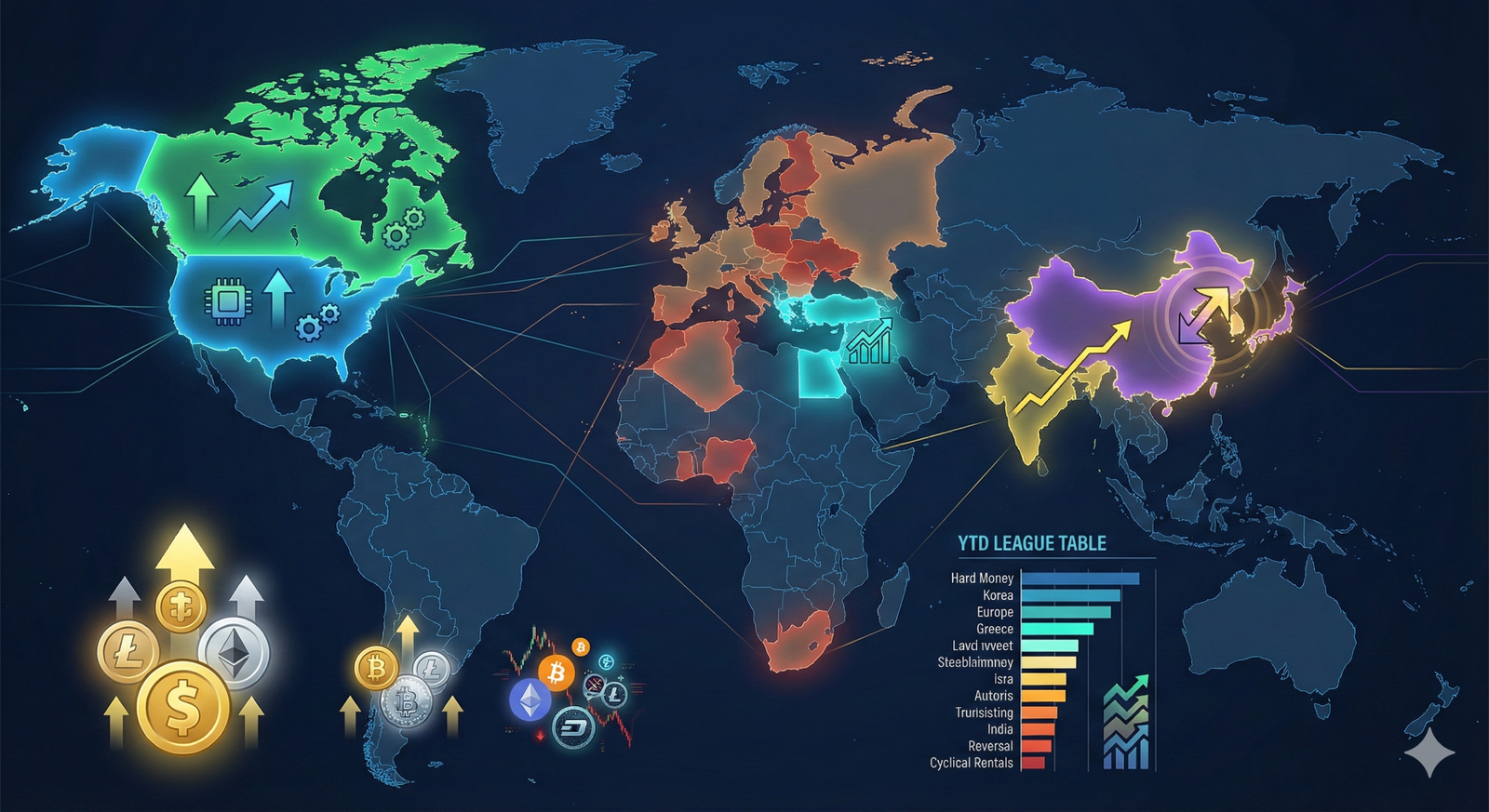
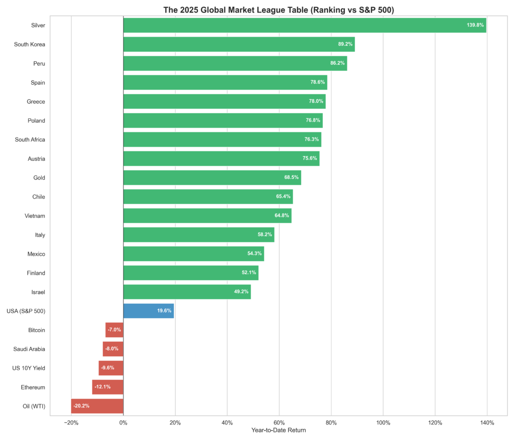
If you look at Figure 1, you’ll see a big grid of markets for 2025, where green means they finished the year in the plus column and red means they lost ground. What really jumps out is how some Asian markets broke away from the pack, thanks in large part to changes in how those countries are run, which helped them pull ahead of the rest of the world. When we look at how different markets actually performed, the biggest surprises came from places that most people had either written off or just stopped thinking about. It’s easiest to see what happened by lining them up against familiar names like the Nasdaq or the big European indexes. South Korea, for example, finally managed to shake off what people called the ‘Korea Discount’ and even outpaced the Nasdaq, which is pretty impressive. Greece, after years of financial headaches, ended up leading Europe. And while many folks assumed digital assets would steal the show, it was old standbys like silver that quietly outperformed them, a fun twist for anyone who thought crypto was the only story worth following. This isn’t about trying to guess the future—it’s about looking back at what really happened, sorting out which markets made real changes, and which ones just got lucky for a year.
Why 2025 was different?
To really understand why 2025 turned out the way it did, it helps to step back and see how the whole system is shifting. For years, the global economy was all about squeezing out every last bit of efficiency, but now the focus has shifted to handling surprises and shocks, even if that means paying a price—what some people call a ‘resilience tax’ that keeps inflation sticking around. When governments ramp up spending to build stronger infrastructure and prepare for whatever comes next, it usually means running bigger deficits, which show up as more debt compared to the size of the economy. That extra debt puts more money into the system, which can push prices up. Central banks can’t just smooth things over with easy money anymore, so the old move of balancing stocks with bonds didn’t work this year; both went down together, and only things like commodities or picking the right countries really helped. We also saw governments, not just central banks, step in to support their economies, especially in places like Poland and India, where big investments in infrastructure and defense really moved the needle. And since the world needs more raw materials for things like clean energy, countries that have a lot of resources—like Peru and Chile—got a real boost, because you can’t just create more copper or uranium out of thin air when demand spikes.
Deep Dives in 2025 Performance
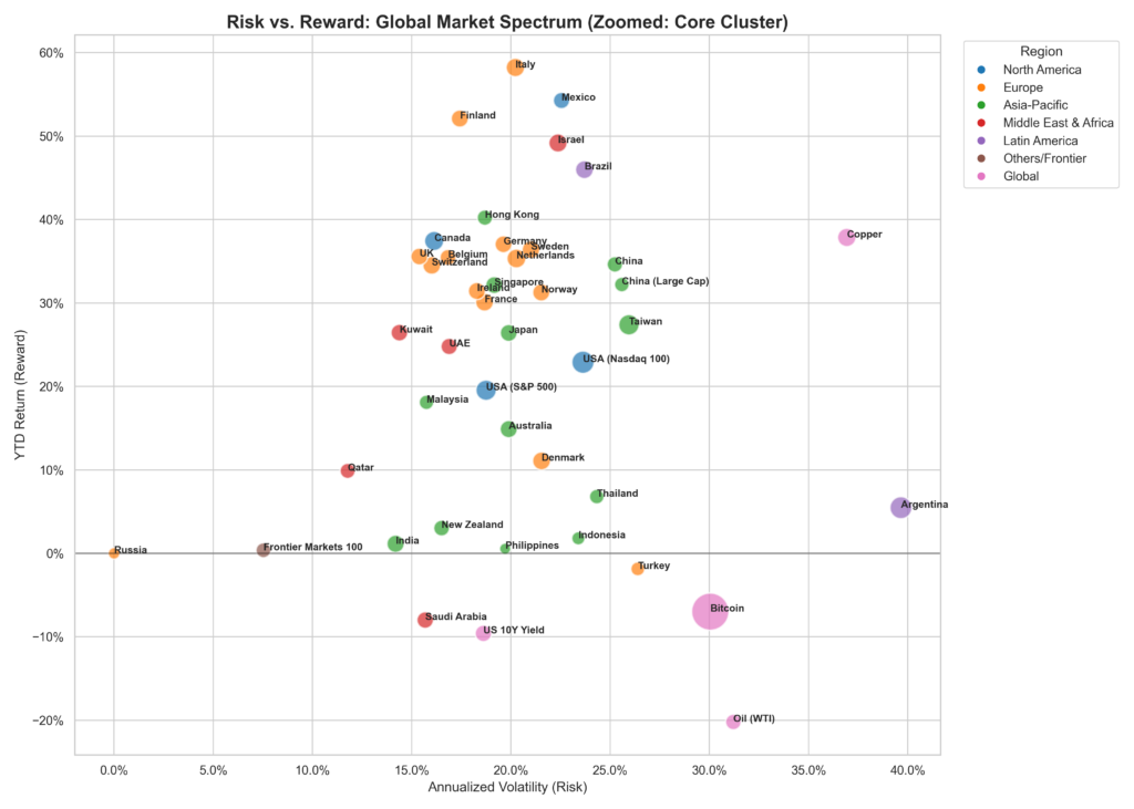
Now that we’ve set the stage, let’s visualize the Efficient Frontier of 2025. In finance, return only has meaning within the context of risk. For example, a 50% return is attractive if volatility is just 10%, but the same return with 80% volatility suggests excessive risk. To clarify this, I plotted every major global asset on our Risk/Reward Spectrum below in Figure 2, with risk (Annualized Volatility) on the X-axis and reward (YTD Return) on the Y-axis. Figure 2 lays out the whole risk-versus-reward landscape for 2025, with each bubble standing in for a different investment. Where a bubble sits left to right shows how bumpy the ride was, while up and down tells you how much it made this year. The bigger the bubble, the better it’s done over the last ten years, so you can quickly spot which markets have been both strong and steady.
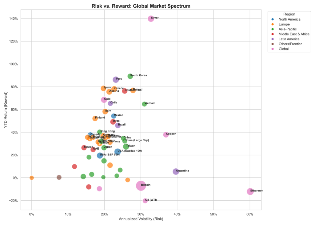
If you zoom in on the main group of markets, you’ll notice that the so-called boring ones, like the S&P 500, show up as big, solid bubbles, which means they’ve been reliable over the long haul. Some of the flashier winners from 2025, though, are just little dots, which tells you their hot streak is pretty new and hasn’t stood the test of time yet. If markets behaved like a simple math equation, you’d expect every investment to land right on a line where more risk always meant more reward. But in the real world, some assets end up above that line, giving you a better return for the risk you took—silver and South Korea were perfect examples of that this year. On the other hand, some investments made a lot of headlines but didn’t deliver much, especially in some frontier markets and certain crypto coins, which mostly just left investors with more stress than gains.
Winners and losers
Let’s take a look at which markets really took off this year and which ones ended up trailing behind. If you stuck with the usual mix of US stocks and bonds, you probably had a pretty solid year, but if you decided to branch out and try your luck in some of the more adventurous corners of the world, you might be feeling like you hit the jackpot. The difference between the best and the average was bigger than anything we’ve seen in a long time, since 2008 in fact, which really highlights just how unusual 2025 turned out to be. To keep things straightforward, I’ll use the S&P 500 as our main measuring stick as we walk through the results together. Figure 4 lines up the top 15 winners and the bottom 5 laggards for 2025, all pulled from Yahoo Finance, so you can quickly see who surged ahead and who got left behind this year.
South Korea’s KOSPI really stole the show in 2025, with the actual market return landing around 71% in local currency. If you’re wondering why our chart shows something closer to 90%, that’s where currency swings come in. When the US Dollar gets weaker, which often happens when the Fed changes course, investors from the US see a bigger boost in their returns. So, if you add a strong local return to a helpful currency move, you end up pretty close to that 90% number. Over in Europe, Spain’s IBEX 35 was another standout, with local returns around 49%. Even though our chart’s 80% figure might be a bit on the high side, Spain still left its neighbors like France and Germany in the dust, thanks in large part to its service-driven economy outpacing the more industrial economies up north.
North American markets were a steady hand in a year full of surprises elsewhere. Canada’s TSX had a strong showing, with about a 29% return in local currency, and if you convert that to US dollars, especially with the Canadian dollar getting stronger, it comes out closer to 38%. In the US, the S&P 500 brought in around 20%, and the Nasdaq 100 did a bit better at about 25%, so while the US had a good year, it didn’t quite match the fireworks we saw in Korea or Southern Europe. What’s interesting is how some markets seemed to do their own thing, regardless of what their central banks were up to. Japan is a great example: it was one of the few countries to actually raise interest rates in 2025, after years of keeping them super low, and still managed to put up a return of about 25%.
Giants vs idiosyncrasies
Before we get into the nitty-gritty, it’s helpful to step back and look at the broader trends that shaped these results. To really make sense of what happened in 2025, you have to look beyond the headline numbers and get into the stories behind them, especially since some regions are all about steady, reliable growth, while others are more about being in the right place at the right time.
The big story in Western markets is still the split between the US and Europe. The US is basically a tech-powered growth engine, full of companies that can scale up fast and keep compounding returns, which is why it’s so hard to bet against. Europe, on the other hand, feels a bit stuck in the past, with its main indexes loaded up on old-school industries like manufacturing and chemicals. Germany, for example, has been hit hard by high energy costs, making it tough for its companies to compete. But if you looked beyond the usual suspects, places like Spain and Greece actually did really well, thanks to strong tourism and support from the EU.
One of the most interesting things this year was watching how money moved around Asia. Japan’s market reforms were the big story for a while, but by 2025, that trade got crowded, and investors started looking for the next big thing. South Korea caught their eye by following a similar playbook to Japan, but starting from much lower prices, which left its market with much more room to grow. Investors just went where the returns were. At the same time, India held onto its reputation as the go-to growth story, even though it’s now the most expensive major market by most measures. People are still willing to pay up because India offers something that’s hard to find these days: steady, homegrown growth.
Emerging markets in places like Latin America and the Middle East really showed how much inflation can shape stock returns. Take Turkey, for example: its market looked wild and unpredictable when measured in dollars, but in local currency it actually did quite well. That’s because when inflation is high, investors often buy stocks not because they love the companies, but because they want to protect their money from losing value. Argentina’s market saw the same kind of swings, bouncing between hopes for a turnaround and worries about another collapse.
To make sense of what’s going on, it helps to think of these markets in two groups. In one group, you have the ‘currency-debasement defense’ trades, where people buy stocks mainly to protect themselves from inflation and a falling currency, like what we saw in Turkey and Argentina. In the other group, you have the ‘corporate-earnings bets,’ which are about real growth stories or smart economic moves, like in Poland, where more spending on defense helped make the economy stronger at the edge of the region.
Even though stocks grabbed most of the headlines, the biggest change in 2025 actually happened in the world of real, tangible stuff—commodities. The so-called ‘supercycle’ isn’t just a theory anymore; it’s a real squeeze that you can feel. Copper, which is needed for everything from data centers to electric cars, is in short supply because we haven’t found any big new sources in years, so countries like Peru and Chile, which have plenty of copper, ended up doing really well. Uranium quietly turned into a winner too, as more people realized that wind and solar just can’t keep up with the power needs of things like AI, so nuclear energy started making a comeback. Oil, for its part, stayed important as a kind of insurance policy against global shocks, since the world actually used more oil in 2025 than ever before, which made energy stocks some of the cheapest bargains out there.
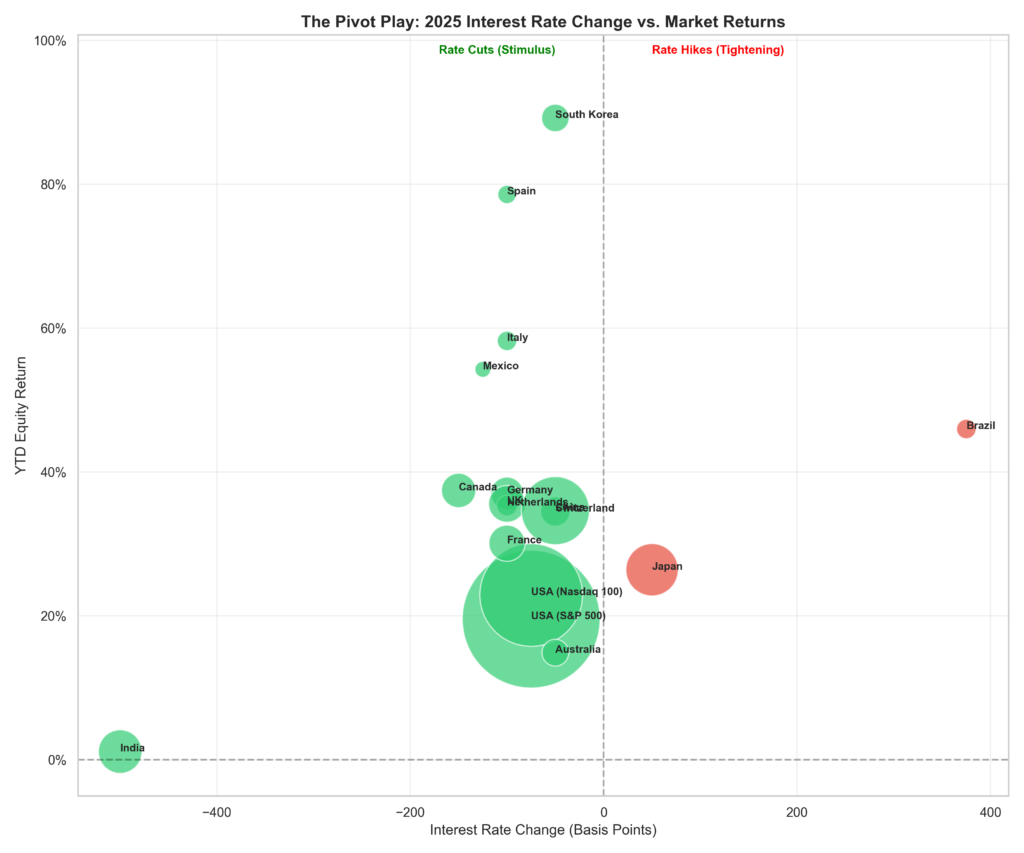
The pivot play
Central banks took very different paths in 2025. While the big developed countries all cut rates together to try to avoid a recession, some emerging markets and Japan actually had to raise theirs. When you look at how rate changes lined up with market performance, the results are pretty revealing. Figure 5 groups global markets by their responses to monetary policy changes in 2025. Markets to the left of the centerline benefited from monetary easing, while those to the right survived or even thrived during tightening cycles. Hyper-inflationary outliers such as Turkey and Argentina are excluded for readability.
For a long time, people thought that cutting interest rates was a surefire way to boost stock markets everywhere, but 2025 showed it’s not always that simple. In the US and Canada, lower rates did help stocks climb, just like you’d expect. But in Europe, even after rates came down, markets like Germany and France barely budged, which suggests that cheap money isn’t enough if the economy itself isn’t in good shape. If you look at it from another angle, maybe the real problem in Europe is more about slow earnings growth and aging populations than about central bank policy. That would mean the best way forward is to focus on fixing those deeper issues, not just hoping for another rate cut. Meanwhile, Japan actually raised rates but still had a strong market, which goes to show that if there’s real growth underneath, higher borrowing costs aren’t such a big deal, while weaker economies just end up needing more help to keep going.
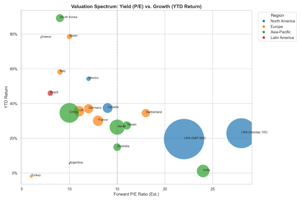
The last thing to look at is price. We lined up all the major markets to see whether you’re actually getting what you pay for, or if you’re paying luxury-car prices but ending up with something a lot less exciting once you look under the hood. Figure 6 plots major global markets by their price-to-earnings (P/E) ratios, with a vertical line marking the healthy average of 15x earnings. This helps readers identify where markets may be undervalued, overvalued, or fairly priced relative to historical norms.
India and the US tech stocks are in the pricey-but-high-growth club, with investors willing to pay a lot now because they believe the good times will keep rolling. That worked out this year, but if growth slows, those high prices could come crashing down. On the flip side, some markets look cheap on paper—like China, Brazil, and the UK—but they’ve stayed cheap for a reason: investors worry about factors like government risk or slow economies. The real sweet spot was in places like South Korea and Greece, which started the year looking undervalued but then delivered big gains as people realized the discounts were over. That’s what happens when a market goes from being a value trap to a turnaround story.
Conclusion
Looking back at 2025, there are two big takeaways that anyone who likes to tinker with systems will appreciate. In the short run, the best results come from spotting unique opportunities—like when Korea or Greece were mispriced and ready for a turnaround. If you want to beat the market in a single year, you have to go off the beaten path and make bold bets on these kinds of stories. But over the long haul, it’s the steady compounders that win out. The US market, for example, keeps showing how tough it is to beat over a decade, even if it doesn’t always top the charts in any one year. So the smart move is to build a portfolio that can handle whatever comes: keep a strong core of proven winners, add some room for special situations, and hold a bit of hard money just in case the financial system throws a curveball.
References
[1] Yahoo Finance, “Historical Data for Global Indices,” 2025.
[2] “The Corporate Value-up Programme,” Financial Services Commission of Korea, 2024.
[3] “Greece’s Debt Recovery and Investment Grade Status,” S&P Global Ratings, 2025.
[4] “World Silver Survey 2025,” The Silver Institute, 2025.
[5] “Global Financial Stability Report,” International Monetary Fund (IMF), October 2025.
[6] “The Future of Copper,” S&P Global, 2024.
[7] “Poland’s Defense Spending and Economic Outlook,” World Bank Report, 2025.

Leave a Reply